Orchard Financial is a wealth advisory group within Ameriprise Financial that wanted to stand out against the other groups in the firm and brand themselves.
BRAND
The Problem: They were just branching off from their Ameriprise parent brand and wanted a quick and simple logo that felt trusting and organic for their financial services.
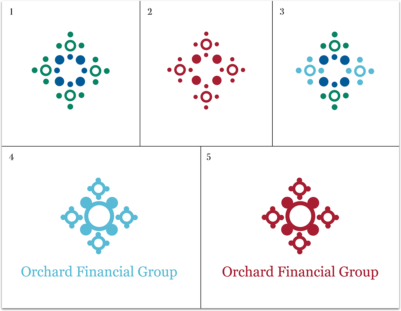
The Solution: Our process included exploring all potential meanings for the word "Orchard" in order to give the logo meaning both as it stands next to the name and if it were ever to stand alone. The final that was chosen by the client was very raw, natural and imperfect much like the seeds that you would find in an apple and the client felt this represented the brand's essence. Below is a deck of the process to get to the final logo.


